
Responsive eCommerce website
Mirror
Project Overview
Challenge
Mirror is a global clothing store established in 1994 with 400 successful stores around the world in 32 countries. Covering the target audience including men, women and kids, Mirror offers good quality clothes for a low price. After years of following traditional marketing strategies, Mirror needs to adjust to the current user needs in eCommerce in order to scale its business for all kinds of stakeholders.
Solution
Design a modern responsive website that speaks to its audience in a user-friendly way: with reflecting current trends and addressing latest user needs.
Rebrand from scratch while saving the original name and speak to the client’s diverse audience in a neutral tone.
Role
UX Designer:
Research
UX / User Experience
UI / User Interface
Interaction Design
Tools
Sketch
Adobe Illustrator
Whimsical
OptimalSort
InVision
Process: Design Thinking

1. Empathize
Research Plan
Research Goals
- Summarize market statistics and trends in fashion industry
- Determine target audience (TA) for Mirror
- Analyze fashion e-commerce competitors in the same segment and with same TA
- Understand how users shop online and in-store (habits, existing mental models)
- Identify users’ motivations, goals, and pain points
Secondary Research
Competitive Analysis: evaluating competitors’ strengths & weaknesses
Market Research: gathering information about demographics and fashion industry statistics
Primary Research
Interviews: collecting feedback from fashion shoppers about their needs, factors of satisfaction and frustrations (pain points), and expectations about shopping in-store and online
Market Research
Statistics
+ Annually in the US, Gen X spends the most ($2,367), Millennials in the middle ($1,950), and Baby Boomers the least ($1,389)
+ 27% prefer online shopping, 43% in-store, and 30% prefer to shop at both.
+ Mobile Shopping is rapidly growing. By 2021, 73% of online sales will be made on mobile
+ 79% of US consumers said that free shipping would make them more likely to shop online
+ 33% prefer shopping online for their apparel because there are more choices available
Trends
+ Fashion retailers with brick-and-mortar stores struggle and go to bankruptcies more often
+ Evolving role of social media in e-commerce
+ Building brand trust is a big deal
Competitive Analysis
I reviewed direct and indirect competitors of Mirror in fashion retail and e-commerce catering to men, women, and kids as well. Evaluating competitors’ strengths and weaknesses determined how Mirror can stand out in its crowded industry.

Provisional Personas

User Interviews
Process Summary
During interviews participants provided their unique experience about shopping for clothing online and in-store. Open-ended questions helped the participants to tell their stories freely and uncovered their implicit needs, motivations, goals and frustrations. Gathered qualitative data from the interviews was transcribed and analyzed for repeated patterns of the majority, which helped for developing the Empathy Map. See full interview notes and Research Debrief for the details.
Interviews Setup
Participants: 6
Average duration: 15-20 min
4 females, 2 males
Age Range: 37-60
Tools used: phone, notes
Research Goals
Gather shoppers’ feedback about their:
Motivations
Goals
Needs
Frustrations
Empathy Map
Visualizing user attitudes and behaviors in the Empathy Map helped me in deep understanding of end users. I color-coded participants and gathered their responses under certain behavioral categories. Then I made a list of recurring patterns, and chose the top 3 to work on for insights and needs.


Persona
The storyboard above and the research done helped me to come up with defining the user persona more closely: who is she, what does she like, what are her goals, frustrations, needs and motivations.

2. Define
Project Goals
After conducting the research and defining user needs, I used a Venn diagram to split the project goals into separate goals for users and business, along with some tech considerations. The diagram helped to clearly see what is overlapping in all three, hence where to focus on for the product development.

3. Ideate
Storyboard
Stories are the empathetic way to define problems. That is why I created a hero story using a storyboard that reflects common pain points and how Mirror helps to solve them. So, taking from the empathy map Needs, I decided to focus on the need of finding right sizes and the need of time efficiency. Then, merging demographics of the interviewed participants and market research (Gen X woman), I created a hero character who represents the majority of online shoppers in fashion market.

Feature Roadmap
The defined project goals helped me in brainstorming all kinds of possible features of the future e-commerce website. View the full Feature Roadmap list.
Card Sorting
After that, I started to think how to organize information on a website easier. Card sorting exercise helped me to understand how users naturally organize products by categories. The similarity matrix is a simple representation of users’ pair combinations. View the Similarity Matrix.
Sitemap
Then, I created a draft sitemap of Information Architecture of a website for Mirror. The sitemap shows the structure of key pages and where they are derived from.

Task Flow
Next, I expanded on several task flows that visualize pathways a user will take in order to complete a task, like Focused search, Adding to bag, Checkout, Delivery Tracking. Explore it on Whimsical
User Flow
Then, I created two particular scenarios close to real experiences of the persona. Each user flow shows how the user persona would navigate the website in a certain scenario to achieve her goal. Explore it on Whimsical
Product Requirements
Following the analysis of the sitemap, task flows and user flows, and also thinking about common features based on the design patterns from competitors’ websites, I made the list of UI requirements for the future website. View the full list
4. Prototype
Low-Fidelity Sketches
Once product requirements were outlined, I started to imagine and sketch in low-fidelity how the homepage for desktop website would look like reflecting those features and user needs.

Responsive Mid-Fidelity Wireframes & Prototype
After sketching, in order to create something tangible to actualize the UX work, I came up with digital mid-fidelity wireframes in 3 responsive sizes (for desktop, tablet, and mobile screens) for the homepage and also for the product details page, following the same design patterns. I tested every wireframe on all three mentioned screens for ensuring a consistent responsive experience with the same visual hierarchy, spacing and flow before adding visual content. The mid-fidelity prototype for sizing testing was developed only in the desktop size.

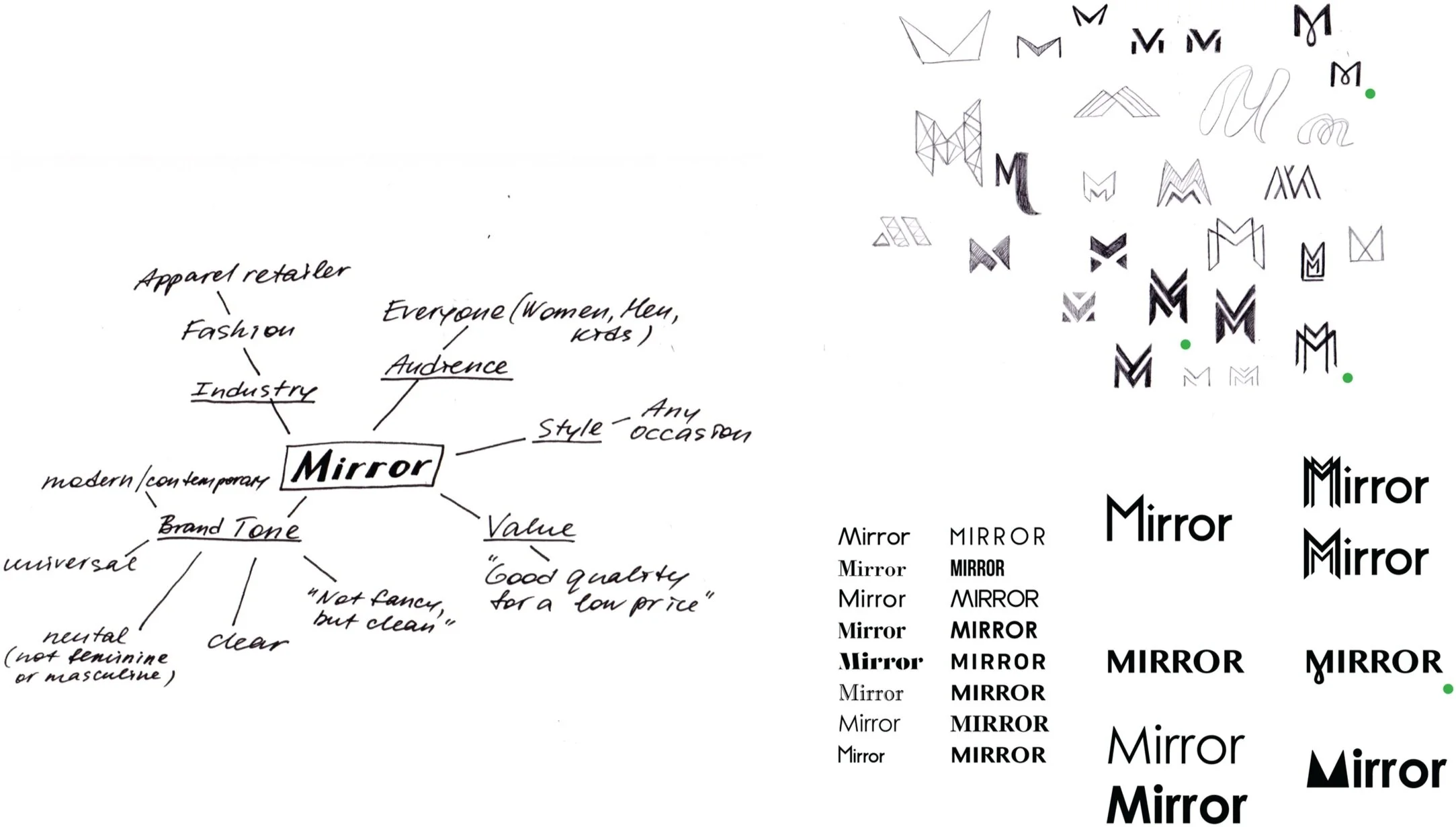
Branding
With the wireframes skeleton done, the visual part with a new branding has to follow. Thus, I developed the logo and brand style tile for Mirror, based on its brand attributes and target audience’s outlook.
Logo Development
Brand Style Tile

UI Kit
With the ready set of brand guidelines, the wireframes need to follow a cohesive visual design system. Here is where branded user interface elements come forward. Ultimately, the UI kit is needed for supporting consistent design patterns throughout different screen sizes.

High-Fidelity Wireframes and Prototype for Testing
Finally, a combination of the mid-fidelity wireframes with branding and UI elements turns to the high-fidelity wireframes and interactive prototype for the desktop size. Overall, it reveals a cohesive UX/UI experience for the responsive website, which is ready for usability testing.

5. Test
Usability Testing
Having a first version of the interactive prototype for desktop website let me to test real users. First, I prepared the Usability Test Plan in order to set my strategy of observing users’ behavior while navigating the website. I had 9 participants performing usability testing with the Think Aloud method while I was listening to them one by one and taking notes. The transcribed User Testing Findings were documented and analyzed for the repeated patterns reflecting positive and negative experiences every user had.
Affinity Map
To clearly see what kind of experiences every user had, I manually created the Affinity Map with sticky notes, color-coding every participant. This method also helped me to find and sort notes/responses for the most repeated good and bad issues of the current design See the full list of the Wins & Pain Points.

6. Implement
Priority Revisions
After reviewing usability testing results, I focused on the most repeated pain points and came up with the solutions for priority revisions. Additionally, I revisited competitors’ websites and discovered some common design patterns I have not noticed before that I could incorporate in my design for matching the existing mental model of online shoppers. Thus, a list of priority revisions was made in order to improve product design and satisfy user needs in a better way.

Final High-Fidelity Wireframes and Interactive Prototype
Implementation of the priority revisions based on the most repeated pain points and design patterns from the competitors turned to the final high-fidelity wireframes and interactive prototype with an improved user experience and user interface.

Outcomes
Learnings
It was very useful and challenging to realize and acknowledge that I am not my users and I have to understand and meet their needs first and foremost.
Solid user research and usability testing feedback is the key for a great UX.
Researching and analyzing competitors’ design patterns played a big role for determining common mental models of users.
Next Steps
Develop missed features (filters, sorting, quantity, zoom-in, image selection on the Product Page).
Conduct another round of usability testing to validate future iterations.
Handoff to developers.