Responsive eCommerce website
Raw Club
Project Overview
Challenge
“Catering for Cats and Dogs” (the current temporary name) is a small local business located in San Jose, CA offering customized raw diet plans for cats and dogs. Currently, there is only a Facebook group for the business with members/customers and a logo. This service needs to adjust to the current user needs in eCommerce in order to scale its business and bring value to all stakeholders.
Solution
Design a modern responsive website that speaks to its audience in a user-friendly way: with reflecting company’s mission and addressing user needs.
The company does not have a defined brand, so create the new name and branding, correlating with the existing logo.
Role
UX Designer:
Research
UX / User Experience
UI / User Interface
Interaction Design
Logo Design: Jane Itkis
Tools
Sketch
Adobe Illustrator
Miro
Whimsical
OptimalSort
InVision
Process: Design Thinking

1. Empathize
Research Plan
Research Goals
1 - Identify the target audience
2 - Indicate the competitors in the industry, their strengths and weaknesses
3 - Determine why pet owners (of dogs and cats) choose raw diet for their pets
4 - Learn about these pet owners’ current experiences of buying raw diet for pets online and in-store/in-person
5 - Identify pet owners’ motivations, frustrations, goals, and pain points
Primary Research
Interviews: collecting fresh data from 5 current customers in-person (one-on-one) about their shopping experiences.
Secondary Research
Competitive Analysis: evaluating strengths & weaknesses of competitors in the RMBD for pets industry
Market Research: gathering information about demographics and the industry statistics
Market Research
Statistics
+ Millennials’ pet ownership (35% of all) has surpassed baby boomers. They spent the most on pet food in the U.S.
+ 60% of pet owners do research RMBD on internet. The low percentage was advised by professionals for the feeding of RMBDs (raw meat-based diets): 12% by breeders, and 9% veterinarians (9%).
+ 94% of pet owners on RMBD believe it brings benefits for pets: shinier coat, muscle mass gain, and cleaner teeth.
+ The main advantage of RMBDs for 57% of the owners was controlling the composition and quality of the ingredients.
+ U.S. sales of fresh pet food in groceries and pet stores jumped 70% to more than $546 million between 2015 and 2018. That doesn't include online sales or people making their own fresh pet food.
+ More than 70% of the U.S. consumers are willing to pay more for healthy pet food products (2018 data).
Trends
- Just as people have become skeptical of highly processed foods for themselves, they're looking critically at their pets' foods as well.
- Raw pet food in frozen or pure form, as well as in freeze-dried or dehydrated form, has grown pretty significantly in the recent years despite some risks and contradictions.
- One of the key trends is the growing popularity of customized pet foods.
Competitive Analysis
I reviewed direct and indirect competitors of the business in the industry of RMBD (raw meat based diet) for pets. Evaluating competitors’ strengths and weaknesses determined how the client’s business can stand out in its emerging industry.

Provisional Personas

User Interviews
Process Summary
During interviews participants provided their unique experience about shopping for RMBD products at the client’s service. Open-ended questions helped the participants to tell their stories freely and uncovered their implicit needs, motivations, goals and frustrations. Gathered qualitative data from the interviews was transcribed and analyzed for repeated patterns of the majority, which helped for developing the Empathy Map. See full interview transcripts.
Interviews Setup
Participants: 5
Average duration: 20 min
All females
Age Range: 37-52
Tools used: notes
Research Goals
Gather shoppers’ feedback about:
Motivations
Goals
Needs
Frustrations
Empathy Map
Visualizing user attitudes and behaviors in the Empathy Map helped me in deep understanding of end users. I color-coded participants and gathered their responses under certain behavioral categories. Then I made a list of recurring patterns, and chose the top 3 to work on for insights and needs.

Persona
The research, interviews and empathy map helped me to come up with defining the user persona more closely: who is she, what does she like, what are her goals, frustrations, needs and motivations.

2. Define
Project Goals
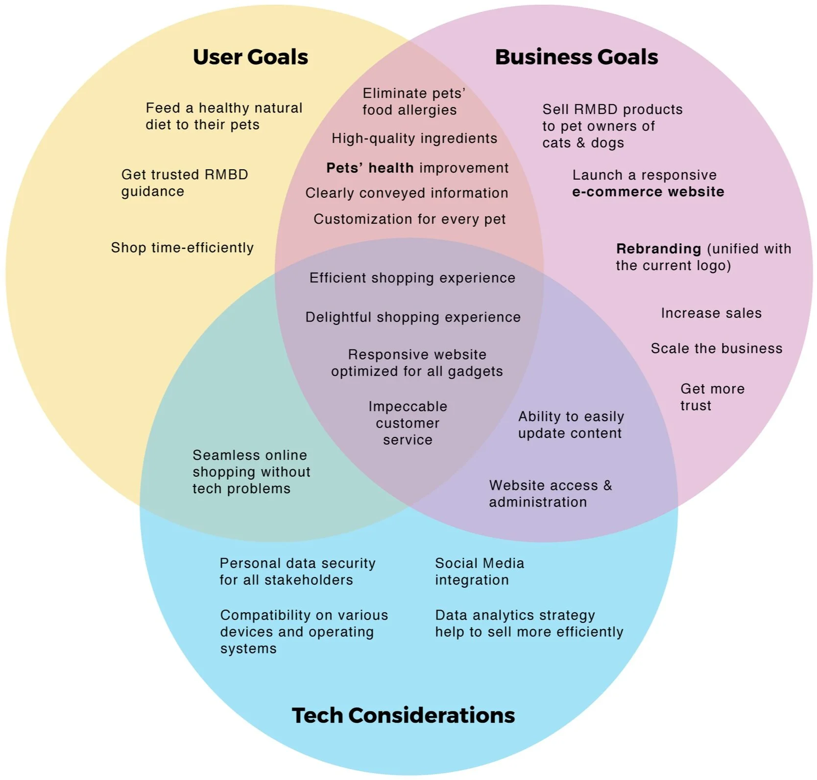
After conducting the research and defining user needs, I used a Venn diagram to split the project goals into separate goals for users and business, along with some tech considerations. The diagram helped to clearly see what is overlapping in all three, hence where to focus on for the product development.
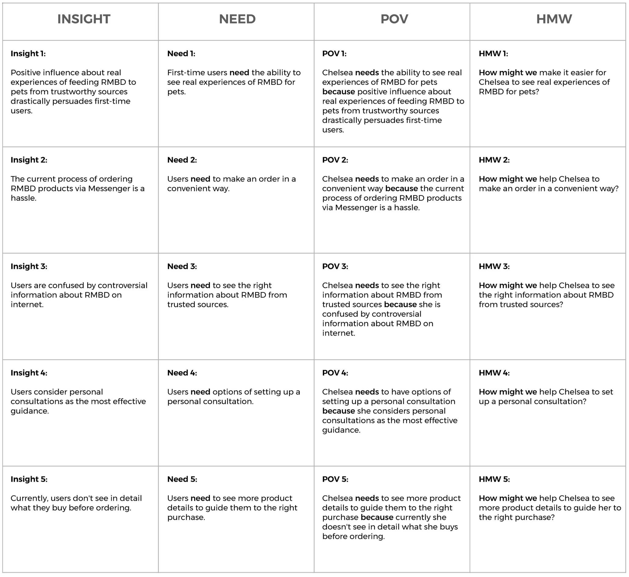
POV and HMW
Based on the Project Goals, I started to define product development strategy with POV (Point-Of-View statements) and HMW (How-Might-We questions).
3. Ideate
Brainstorming
After selecting the most valuable HMW questions to solve, I started to brainstorm on the possible solutions for each issue.

Product Roadmap
The defined project goals helped me in brainstorming all kinds of possible features of the future e-commerce website. View the full Product Roadmap.
Sitemap
Then, I created a draft sitemap of Information Architecture of a future desktop website. The sitemap shows the structure of key pages and where they are derived from.

Task Flow
Next, I expanded on several task flows that visualize pathways a user will take in order to complete a task.
User Flow
Then, I created user flow shows how the user persona Chelsea would navigate the website in a certain scenario to achieve her goal.
UI Requirements
Following the analysis of the sitemap, task flows and user flows, and also thinking about common features based on the design patterns from competitors’ websites, I made the list of UI requirements for the future website. See the full list of UI Requirements.
4. Prototype
Low-Fidelity Sketches
Once UI requirements were outlined, I started to imagine and sketch in low-fidelity how the homepage for desktop website would look like reflecting those features.

Responsive Mid-Fidelity Wireframes & Prototype
After sketching, in order to create something tangible to actualize the UX work, I came up with digital mid-fidelity wireframes in 3 responsive sizes (for desktop, tablet, and mobile screens) for the homepage and also for the product details page, following the same design patterns. I tested every wireframe on all three mentioned screens for ensuring a consistent responsive experience with the same visual hierarchy, spacing and flow before adding visual content.

As the main focus was on creating a desktop experience. I created additional wireframes for desktop size and then created an interactive prototype for the upcoming user testing sessions.

5. Test
Usability Testing
Having a first version of the interactive prototype for desktop website let me to test real users. First, I prepared the Usability Test Plan in order to set my strategy of observing users’ behavior while navigating the website. I had 5 participants performing usability testing with the Think Aloud method while I was listening to them one by one and taking notes. The transcribed User Testing Findings were documented and analyzed for the repeated patterns reflecting positive and negative experiences every user had.
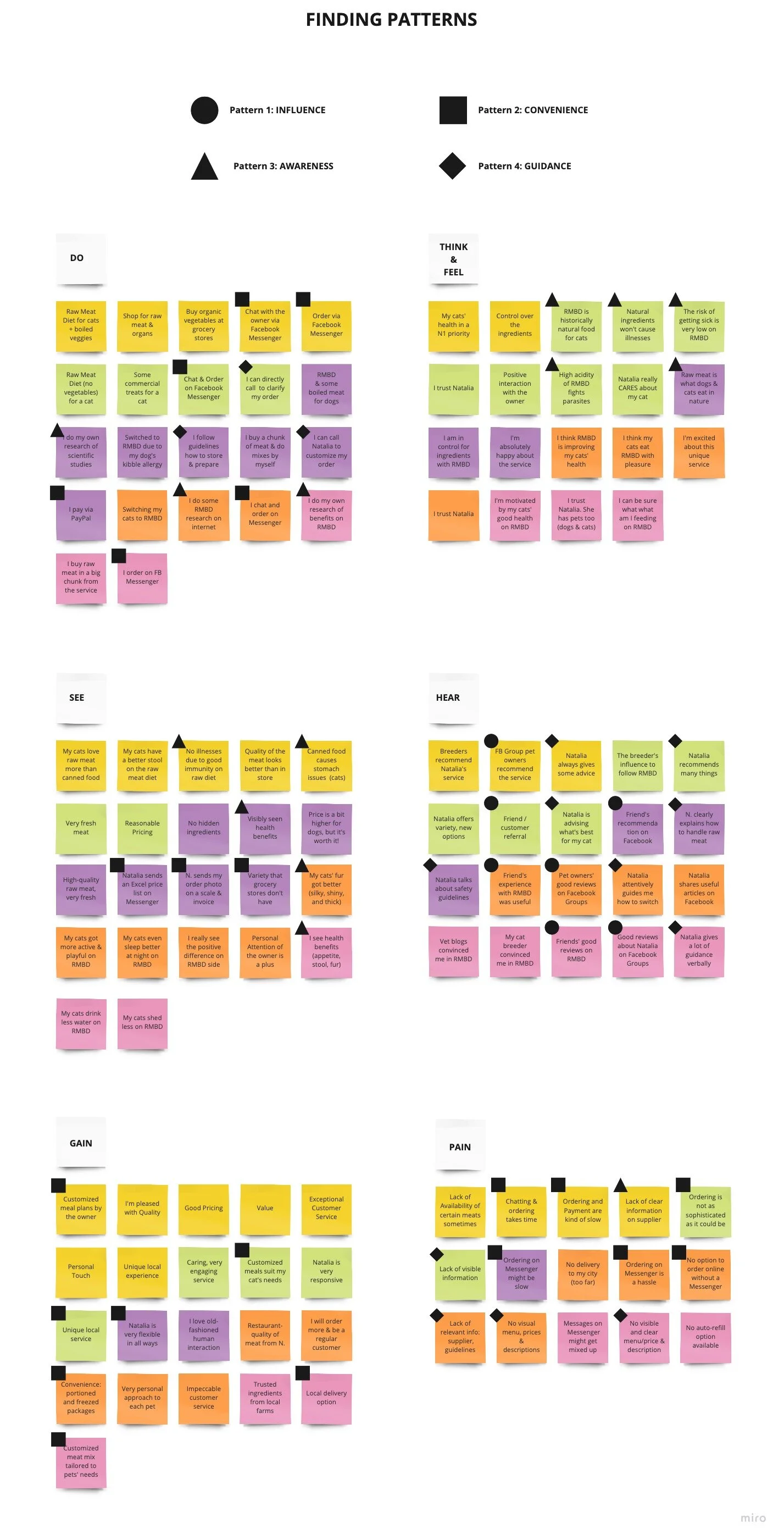
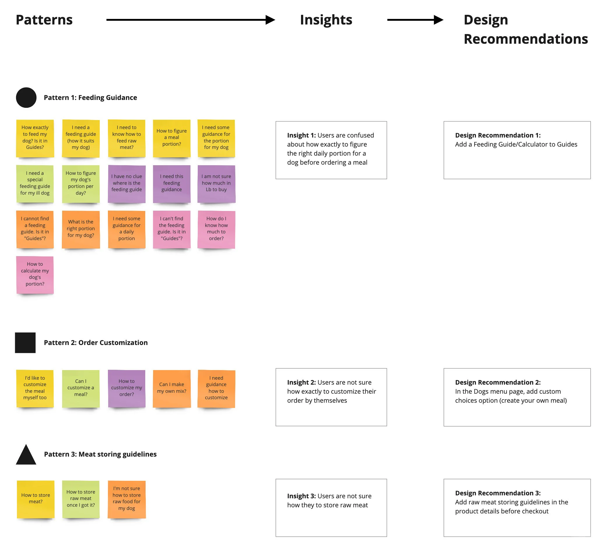
Affinity Map
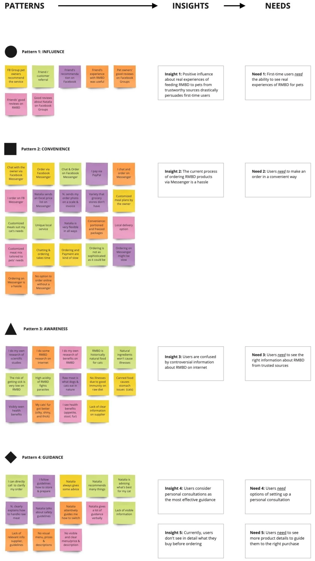
To clearly see what kind of experiences every user had, I created the Affinity Map with sticky notes in Miro, color-coding every participant. Then I marked 3 patterns in the Pain Points by different shapes, analyzed each pattern, and from there outlined the Insights. Next, I came up with my Design Recommendations how to solve the occured issues.


Revised Mid-Fidelity Wireframes & Prototype
Implementation of the design recommendations and revisiting design patterns from the competitors turned to the revised Mid-Fidelity wireframes with an improved UX.

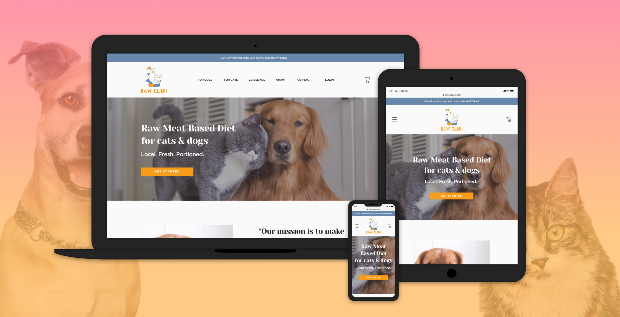
Branding
With the wireframes skeleton done, the visual part with a new branding has to follow. Thus, I created a new brand name and style based on the existing logo (credit: designer Jane Itkis) given by the business owner.
Naming

Mood Board

Brand Style Tile

UI Kit

Final High-Fidelity Wireframes and Prototype
Finally, a combination of the mid-fidelity wireframes with branding and UI elements turns to the high-fidelity wireframes and interactive prototype for the desktop size. Overall, it reveals a cohesive UX/UI experience based on the user testing feedback.

Outcomes
Learnings
It was very useful and challenging to realize and acknowledge that I am not my users and I have to understand and meet users’ needs first and foremost.
Feedback from research interviews and usability testing truly helped to shape a better UX.
Researching and analyzing competitors’ design patterns plays a big role for determining common mental models of users.
Next Steps
Develop missed features (Get Started/pet profile, checkout, user account).
Conduct another round of usability testing to validate future iterations.
Handoff to developers.